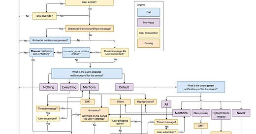
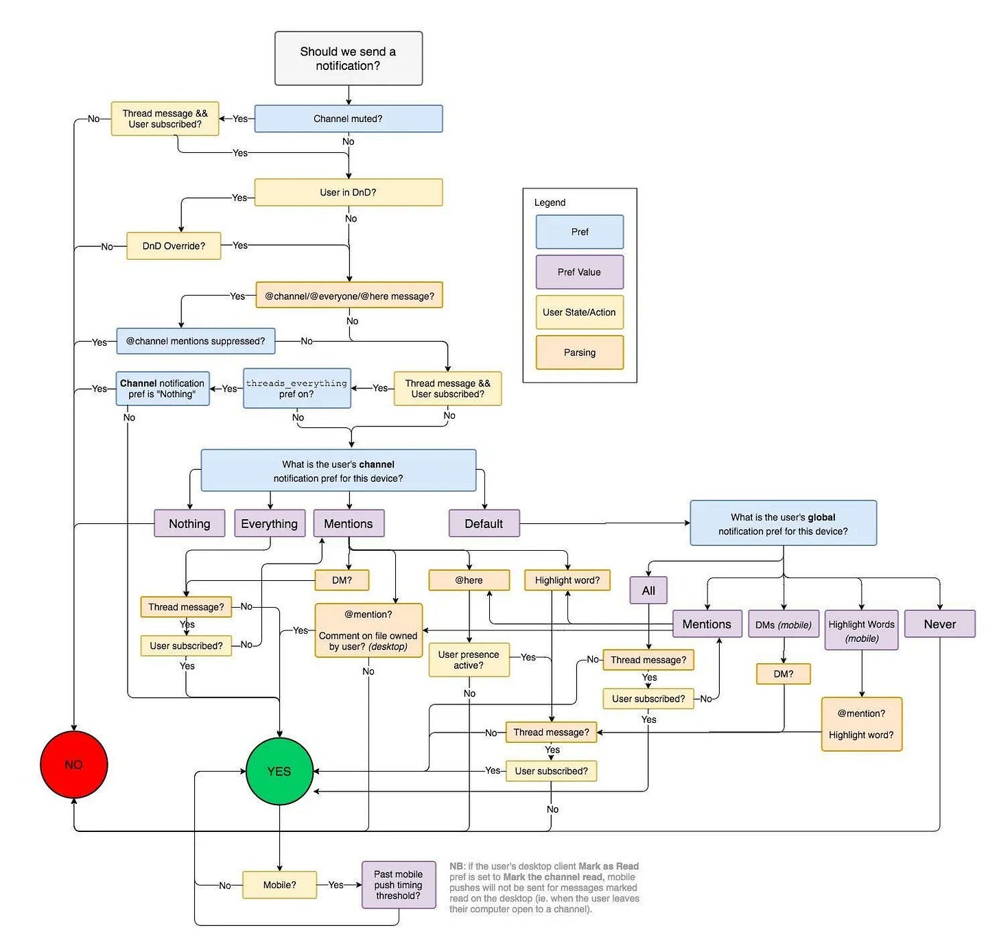
This is the flowchart of how slack decides to send a notification.
It is a great example of why a simple feature may take much longer to develop than many people think.
When we have a great design, users may not notice the complexity because it feels like the feature just working as intended.
What’s your takeaway from this diagram?
Image source: Slack Eng blog


Which tool was used to make the infographic?